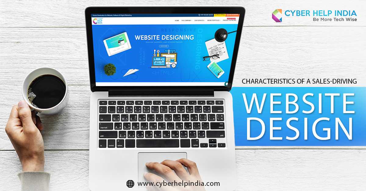
Every business owner knows by now, how a good website design can sway their customers. A good website can have a massive positive impact on buyers and their choices. On the contrary a bad website is bound to hamper the authenticity of your business. The main purpose of your website is to attract more potential customers for the exposure of your products or services. Most of the people who visit your site for the first time are not ready to buy; they are most likely just browsing through, investing their options and comparing them. Contact a website design company in Siliguri to create the best website for you.
Table of contents:
- Color
- Video content
- User Friendly Website
- Free offers
Here are a few changes suggested by a website design company in Siliguri you can make to your website to drive up your sales.
Color
It is wise to take note that red and green are the colors that are people with color blindness struggle with the most. If your audience is largely targeted towards women, it might be a good idea to incorporate shades of blue, purple or green into your design.
Similarly if your business mainly targets men opt for colors like blue green and black. This obviously is a generalized preference and there are a lot of other colors you can pick from. Although, it might be helpful for you to know that brown and orange are considered the least favorable colors.
Video content
It is no secret that video content fairs better in comparison to written text. Video content is more engaging and has the ability to hold the visitor�s attention for a longer time. It even allows you the space for more creative freedom. This being said, try not to add videos that are too lengthy as it dulls the viewer�s interest. Videos that are up to 3 minutes long work the best for websites.
User Friendly Website
With the internet hoarding billions of websites, the visitors aren�t going it to stick around if the website is complicated and difficult to operate. People want convenience and no one wants to sit and waste their time learning how to operate a website. Create simple navigation so users can easily search for and find items that aren�t on the first page.
Free offers
Nothing drives the masses like the word �FREE�. Whether you are offering a white paper or other free item, make sure the word “free” comes through loud and clear on your home page. You can even offer free services like a one month free trial or free shipping for your products and services.
Cyber Help India is one of the most proficient digital marketing agencies. We are also the most recommended website design company in Siliguri, Sikkim and Kolkata.


