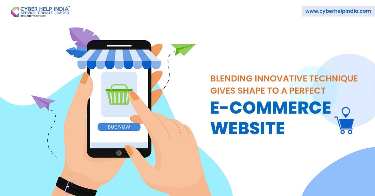
Whether you are trying to impress existing customers or gather new ones, using the latest designs for your e-commerce website is the way to go. Keeping up with the trends subtly suggests that your brand is modern and cutting edge, this in turn can set you apart from your competitors. Ecommerce web design in Siliguri has successfully managed to keep up with the times, repeatedly.
Table of contents:
- Center Navigation
2. Creative page transitions
3. Neutral background colors
This begs the question, what are the latest trends? Listed below are three innovative designs that provide the perfect look to your e-commerce website.
Center Navigation
Traditionally, the design goal for navigation menus was to make them easy-to-find while keeping them largely out of the way. This was done so that you could use the screen for home page features. But lately, all of the norms are being broken down as a new way of thinking has come to light. This idea circulates around letting the navigation menu take the centre stage.
This is not only a revolutionary design option but it is also extremely functional. Considering how using the user almost always clicks on the navigation button first. When this design is executed well, you can turn your menu into a visual attraction in itself showcasing branding elements like your color scheme and characteristic fonts. This innovative design makes it clearer, easier and more visually appealing for the visitors, especially for the first timers.
Creative page transitions
Technological advancements largely influence what effects are accessible to the brands. Right now, nifty page transitions take the cake. They are subtle and technically optional, but they do make for an extremely engaging customer experience. Visitors usually tend to enjoy animations when they are easily noticeable on the website.
Although, for most part they are strictly there for aesthetic purposes, a clever designer can take it upon themselves to integrate fashion and function for this one.
Neutral background colors
Flashy futuristic designs have had their day in the sun, now it�s time for the quaint neutral background colors to shine. This in terms of design translates to using a pale background palette for your website. Done with the monotony of plain white, designers are now opting for cool greys, warm cream and sand tones, soft yellows and taupes.
The ecommerce web design in Siliguri uses pale background to serve as a perfect setting for highlighting the other important visuals such as the product photos and videos, all the time. It also provides a softer pleasant experience where the visitor isn�t overwhelmed by the bright and clashing colors.
Contact Cyber Help India, to get the best ecommerce web design in Siliguri for your online business. The team at Cyber Help takes your inputs into consideration to give you the best service.


