The generation is already moved into the digital world by helping people in many ways. Communication becomes easier and people start managing their time in a better sense. In this era of digitalization, the website plays an important role to improve the brand image of your company. While designing a website you might put your best efforts in order to catch the attention of others by keeping the website informative and genuine. Different pages and links are attached to the website to give proper information but arranging those links is not an easy task for any developer or designer.
A website footer is one of the most important parts of any website design which provides information with additional links, blogs, highlighted posts, branded graphics, and a contact form. To make the website attractive and appealing you need to work over designing and arranging of posts and links in a systematic manner so that visitors will feel comfort in reading. These days’ extra-large website footers are on-trend and give more space to designers to share useful links and other information. Here, we come with some of the important tips that help you in designing organized footers on your website.
Tips for Designing Website Footer
Organize Link Hierarchies
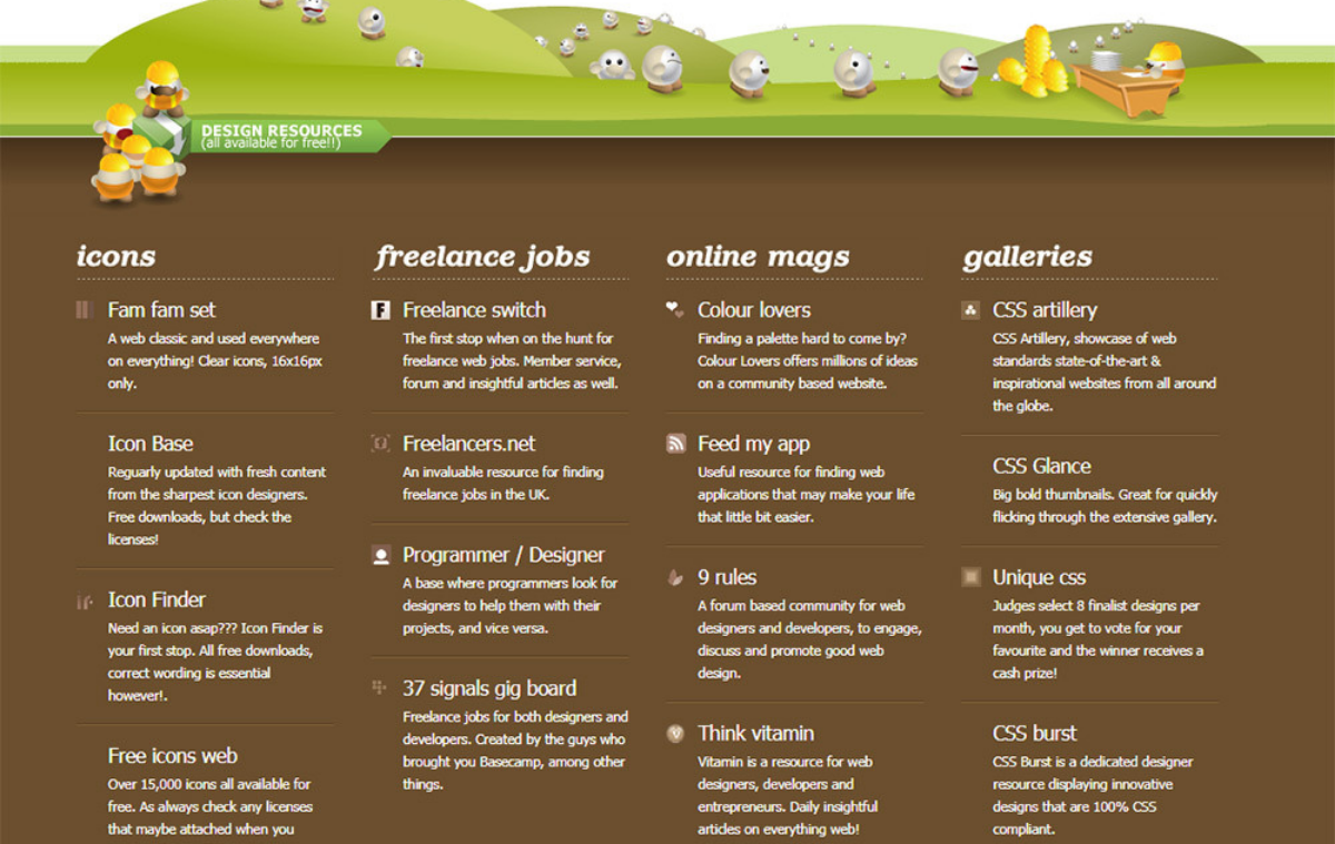
When you have enough space in your footer you must design it in organize way right? So, filling up the footer with information really needs creativity and effective efforts. You can�t just put the things to fill up your free space. Select some blogs and interesting links that catch the attention of viewers and make them aware of your website. If you don�t have blogs to share then categorize your services and put them in the footer with heading and subheadings.
All the services and posts are not relevant for your top navigation page so you need to place them in the footer in an organized way so that they will look appealing. The most common and standard designing goes with keeping the heading in bold and in bigger size whereas the subheading is shown in a smaller size. But you make sure the smaller font must be readable for viewers.
Add a Contact Form
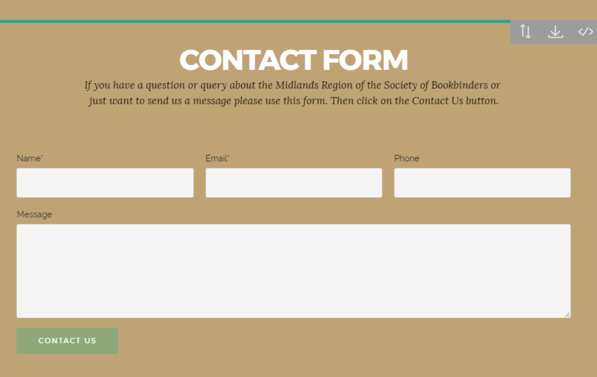
One of the most appealing and generous ideas of designing a website footer comes with adding a contact form. The contact form makes the thing communicative as the customers and viewers will find a valid option to be in touch with you. They might give you some feedback or just ask you about any particular service. But simply adding a contact form will not work because unless you work on the designing part you can’t catch the attention of viewers, a good design will always make a sense. Try to make your contact form simple but creative.
It is always better to take ideas from popular websites but in the end, you need to place your ideas to make it different from others. Contact forms also help you in getting information about the interested customers so that you can get back to them if required.
Branding and Graphics

Branding is really important to make a space in others minds and here when it comes to designing the website footer you must display your brand name with smart graphical tools. The eyes work before the brain and it really works in every field. Just think about any website that provides very important and useful updates but fails to impress the viewers through the graphical presentation, the number of visitors will be lesser in comparison to that site which looks attractive.
Add the logo and other promotional services to highlight your specialties. Once people scroll down your website and find such information with an appealing graphical presentation, they will simply stick to your site and share it with others. You can also add unique quotes, social media links and eye-catching graphical background to old values in an aggressive way.
Add Related Contents
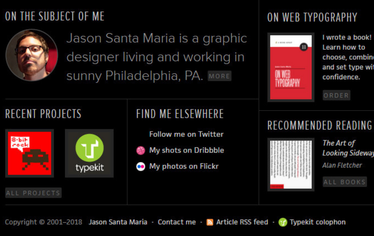
Engaging people into your website are really important to improve your popularity and in maintaining the brand image. You can share links that are not placed elsewhere in the site or just push some encouraging and unique contents to attract people into your website. There are so many interesting posts available on the internet you must ask the owner if they have any objection in sharing their post on your site. Generally, they will allow you in doing so because sharing their posts will also increase their popularity in terms of engaging people into your website.
Sharing information about related products, social feeds and blog posts will make sense in organizing your website footer. Whenever you share any post or link just make sure that the contents but be valuable to your audience. No one is interested in searching what you are doing whereas they will find the interest if you are doing something interesting for them.
Capture Emails

Building a relationship with your visitor is really important and adding email fields at the top of the footer is also a great idea to increase your subscriber database. By taking the emails you will actually improve the bonding which will definitely help you in getting in touch with the interested visitors. Visitors who will put their email are obviously interested in your services or simply get impressed with your designing part.
So, you can add the box to enter the name and email id choosing the right color and style. Take a look around your favorite sites to get some idea about designing the email fields. Capturing email make a sense in designing the footer and impress the viewers as it adds values to them.
In the End
Everyone comes with a different idea and perspective to make the footer look appealing and attractive but it is recommended to make a list website and analyze them with the depth. Try to add more sense into your own website footer so that viewers will get engage in your site. The footer design must meet the latest trend and come up with detailed information about the company.


